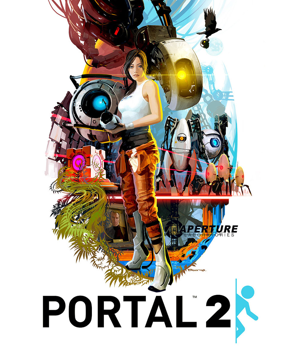
Digital fan art by Tristan Reidford, USA. Quote from the artist: "Inspired by the great movie posters of the 70s and 80s, in particular the work of Robert McGinnes, I tried to take all the main elements from the game and incorporate them into one image."
Love Coolvibe? Please share!












Awesome!
Awesome!
I will start off by saying the overall quality of the artwork presented here is excellent in execution.
I truly hate to be this guy… however, the ways in which you have taken liberties with Chell’s appearance are quite disturbing. Chell is a very thin athletic woman with a strong Asian ethnicity and the image you have given us here, the one that is endowed and curvy with large lips and makeup sort of destroys the original spirit of the character.
You are far from the first person to do this as seen here: http://www.gamecareerguide.com/db_area/images/item_images/100520/image013.jpg
I find the tweaking of images in these such ways to reveal certain characteristics of the direction video game art and characters have been going for a long time.
I’m sorry to pick apart your art like this, and if you re-read the first line I believe your colors and execution are spot on. I know I could not draw something this well myself.
DISCLAIMER: I am not an angry feminist (not even female), and PLEASE feel free to e-mail me if you would like some intellectual discussion.
Awesome!
If there were a real poster version of this, I’d sign up to buy it.
Actually I think the artist should have gone bigger to account for her generous…ness. Great work btw
@Ensayia don’t fret, I agree. I think the image presented is awesome, but you have to wonder what good it does exactly to increase her cupsize and somewhat downplay her ethnicity. Although the image you link (of Faith from Mirror’s Edge) seems like a worse example of same. More so considering it’s a rework of the exact image, where I think this movie poster is more of an interpretation. In fact, I expect many actresses in the 70s and 80s got a bit of a boost and a lift on the posters as well, to attract the “right” audience. Considering that this poster is probably aimed at a North American public, that would explain the changes, though it makes me no less sad that these changes are effective – the reasons behind it aren’t exactly laudable…
@Ensayia
Male also and my first thoughts were exactly the same as yours so no worries…
@Ensayia
I really don’t think there’s anything “disturbing” about this depiction of Chell at all. Chell does not appear to be strongly Asian in either the games nor Valve’s promotional illustrations of her. If you look at the box art of Portal 2, you’ll notice she has light colored eyes: a European trait. Yes, she does also have some asian facial characteristics, but I think it’s clear that she is of mixed ethnicity rather than being “strong”(ly) asian. Here’s a screenshot of her from the second game: http://4.bp.blogspot.com/-QZA_827gPNo/Tcw1-ukhgpI/AAAAAAAAAYQ/xC-iJqYRj4E/s1600/Portal2-Chell-Potato.png That being said, the larger breasts she’s been given in this poster are stylistically altered to mesh well with the 1970′s ideal. The artist can do that, because Chell is not a strongly defined character; in the games, she doesn’t even talk! Everyone has their own view of her, and that’s the kinda the point. Because of this, we’re able to step into her shoes.