tp://coolvibe.com/2010/reload/">
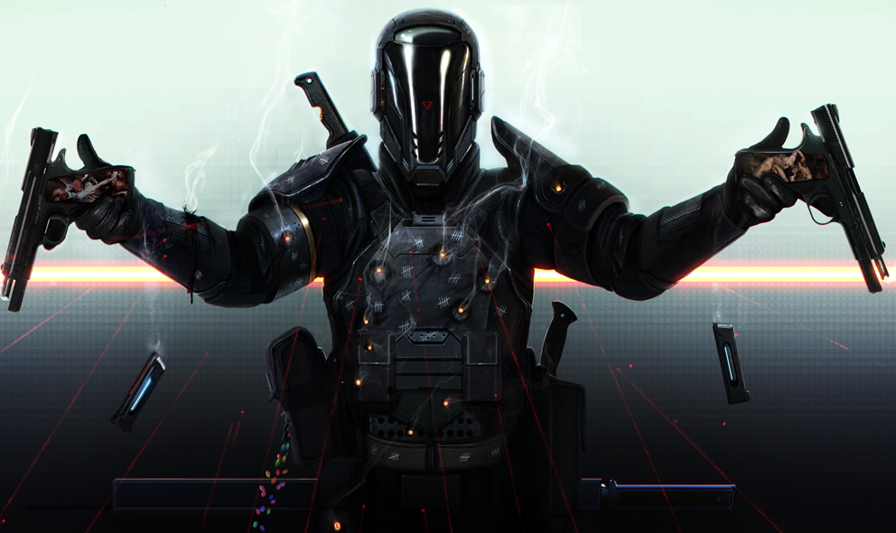
Concept art by Dan Luvisi, United States, as part of the upcoming graphic novel Last Man Standing. More from Dan Luvisi on Coolvibe.
Love Coolvibe? Please share!
tp://coolvibe.com/2010/reload/">
Concept art by Dan Luvisi, United States, as part of the upcoming graphic novel Last Man Standing. More from Dan Luvisi on Coolvibe.
Love Coolvibe? Please share!
Leave a comment using Facebook Comments, or our own comment form to the right.
You can also join the discussion on our Facebook page!
Coolvibe on Facebook
what makes this piece so interesting, to me, is the jelly beans!
I hate it when artists don’t know when to stop.
I mean, the drawings on the guns don’t make a lot of sense with the futuristic suit… but let’s pass on this.
The kill counts on the suit don’t make sense either. They should have been more or less all at the same place (shoulders, upper torso, places easy to draw on).
And the jellybeans are ridiculous. They’ve been added in a hurry, and the way they fall is not realistic.
Overall, amazing drawing, but bad composition.
Better to stick to the essentials!
Nathan I think your a bit ridiculous now. Since when art had specific rules which artist needs to follow?? And ur the judge? I don’t know personally who the artist is, and this is the first one i’ve seen from him, but I think that his style is to make little extra details to his works. And what the fuck is wrong with that?? THATS RIGHT!! N000OTHING!!
Why don’t you go draw a Mona Lisa or something and stay away please.
As this illustration is part of a graphic novel I assume some of the details that so perturb Nathan are further explained if you read it… On the other hand, jelly beans are tasty and, as such, are useful at any time.